Today's Gold Story in 5 Charts
How gold got here, and why...
LET'S LOOK at five critically-important charts which tell the story of this market, writes Adam Sharp in Addison Wiggin's Daily Reckoning.
First up, the performance of gold miners vs other sectors in 2025.
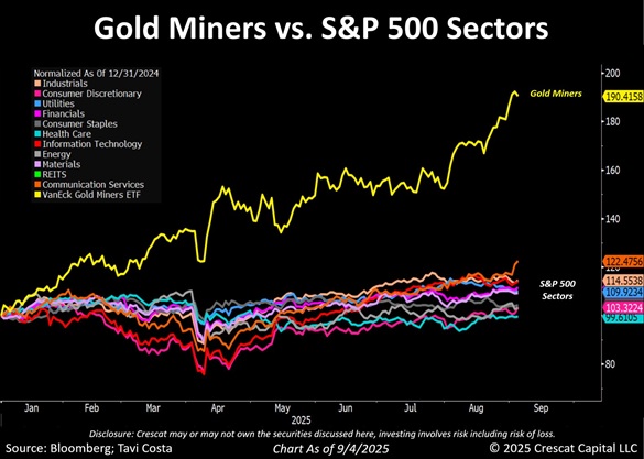
Incredible outperformance. Gold mining stocks are finally getting the respect they deserve. With spot metal prices soaring, profitability in this sector is exploding.
However, we're coming off more than a decade of underperformance of gold miners, so this catch-up period is just getting started.
Next, jobs revisions and rate cuts.
BLS revisions released this week showed a shocking trend in payrolls. Apparently a lot of the jobs created under Biden were a mirage. We haven't seen a downward revision this big since 2009 during the crash.
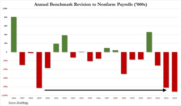
This historic revision sets the stage for interest rate cuts from the Fed and other central banks.
The Fed pretended to be a responsible central bank for a while, keeping rates at respectable levels. But that period is now coming to a close.
Lower rates should push the Dollar down and continue to boost gold and silver prices.
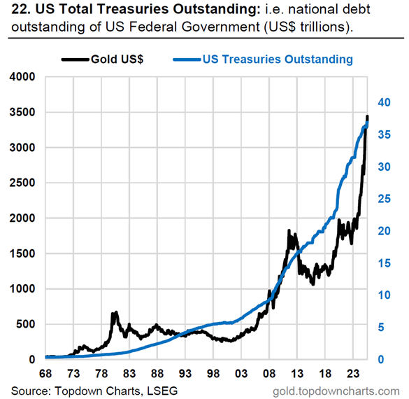
Gold has already been on an epic run lately. But there are rock-solid fundamental reasons for its ascension. As we can see in the chart below, gold is tracking closely with the sum of US Treasuries outstanding (US government debt).
2022 changed everything, as the chart below shows.
It tracks the relationship between the real return of the 10-year US Treasury bond (accounting for inflation) vs. the price of gold.
As you can see, the two tracked closely right up until 2022. As we all know, after Russia invaded Ukraine in 2022, Biden and NATO seized Russian central bank assets.
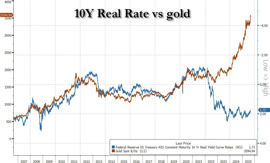
The seizure of Russian assets set off a major trend of central banks switching from Dollar assets to gold, which is only strengthening (as we will see in the next chart).
In the future, Russia's invasion and the US response of weaponizing the Dollar will go down as a major turning point in the gold story.
The chart below shows the rise and fall of various assets in international monetary reserves.
Look how dominant gold (beige on the chart) was from 1900 through the mid-1980s. Then the Dollar (in red) shot up to become the world's most dominant currency. Now, the trend has finally changed and gold is reclaiming its rightful place in the global monetary order.
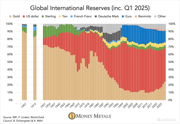
Despite its impressive comeback, gold today still only makes up 24% of total global reserves. If it climbs back to 60%, or even 70%, the price will need to continue its current run.
Gold, silver, and miners have performed quite well over the past year. But if you get one takeaway from today's charts, it should be that this bull run has plenty of gas left in the tank.
A global debt spiral is underway. Central banks have finally gotten the memo that gold is in, and fiat is out. The Fed is about to restart money-printing operations.
Americans are struggling to get by, and stimulus packages will be unleashed soon.
The precious metal bull market is officially underway, and we expect a broader commodity boom over the coming years. There will be many opportunities to make outsized returns going forward.


 Email us